
A marketing landing page and app for an AI writing tool.
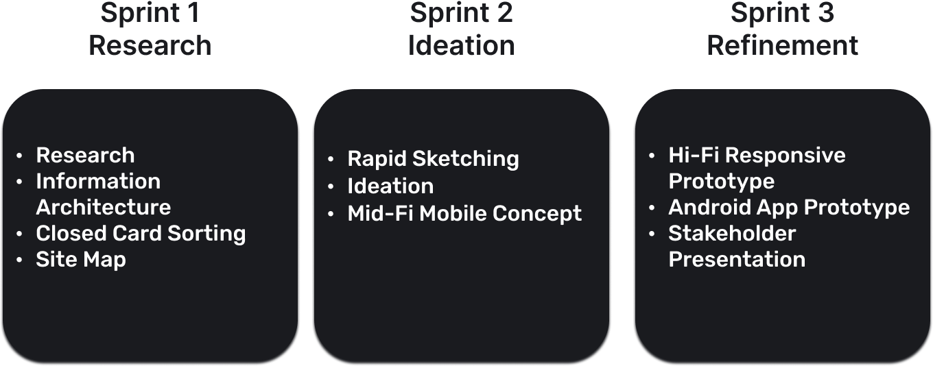
Originally a student project while at the Flatiron School, this case study was a 3 week sprint that began with a brand needing a marketing landing page across all platforms and a hi-fi mobile app concept for their AI content generator called Haydn. The brand provided a style guide with header/body content, a color palette to choose from, a font hierarchy, brand adjectives, and basic wire frames. In terms of research, I conducted a competitive analysis of other AI content generators and also conducted close card sorting with 4 users to help develop the information architecture and site map of the project. The major constraint of the project was the lack of user testing. While there were lots of collaborative feedback sessions between myself and other classmates to give each other critique throughout the process, no actual user testing was done on the landing page or mobile app concept.
Lead UX/UI Designer
Figma
Optimal Workshop
Card Sorting Results, Information Architecture, Site Map, Mid-Fi Mobile Marketing Landing Page Concept, Responsive Hi-Fi Marketing Landing Page, Hi-Fi Android Mobile App Concept
Haydn AI needed a marketing landing page to draw in new users and a hi-fi prototype of an android mobile app that would allow the user to easily use AI to aid their writing.
The project was a 3 week sprint from November 21-December 9 2022.
Due to the speed of this project I only had time for one type of card sorting when testing the sitemap hierarchy. From the initial brief I had a good idea of the categories needed, so I decided to go with closed card sorting. In a world with more time, it would have been great to do both open and closed. By beginning with open card sorting I would have had the opportunity to discover categories that participants came up with while testing. From there I would have tested the new categories in closed card sorting to see how effective they were in grouping the elements of the site map.
Another constraint was only being able to test three users due to lack of availability around Thanksgiving. The participants included a ceramics artist, a product owner for an insurance company, and a software engineer.
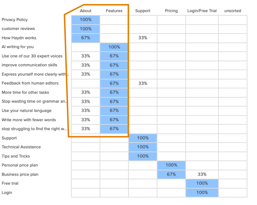
There was too much overlap in “About” and “Features”. This led me to add “About” as a dropdown of “Features” in the finalized sitemap (below)

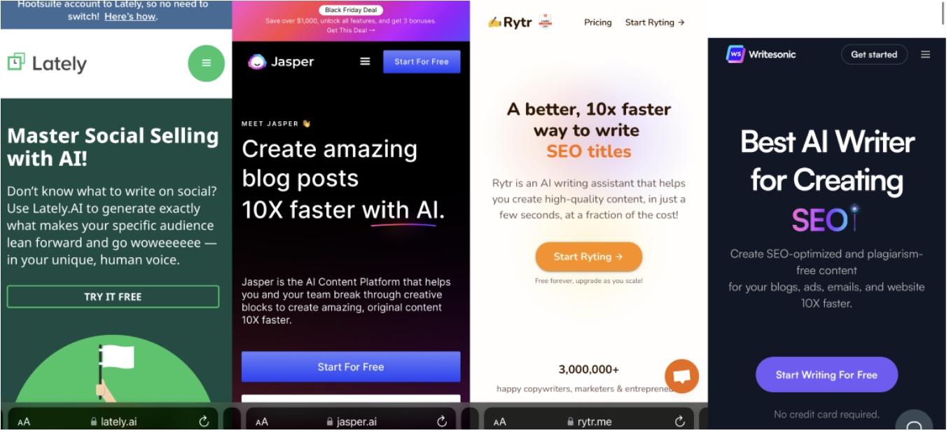
The landing pages that I found to be effective had Free Trial CTAs throughout the page to allow the user to learn more when discovering a new section.
I started out by making a mid fi wireframe where I did not focus on color. The goal here was to figure out what content I needed on the landing page and a visual hierarchy. After I had a plan of where things would go on the page, I moved onto hi-fi concepts where I added color schemes derived from the style guide and specifically their “beachy” adjective given in the brief. I really liked the mood these colors gave until a fellow UX designer asked me if I had checked the colors for accessibility. They all failed!
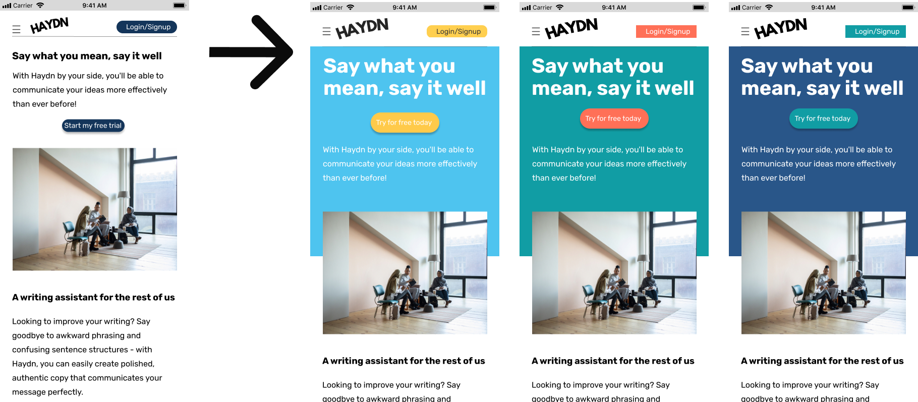
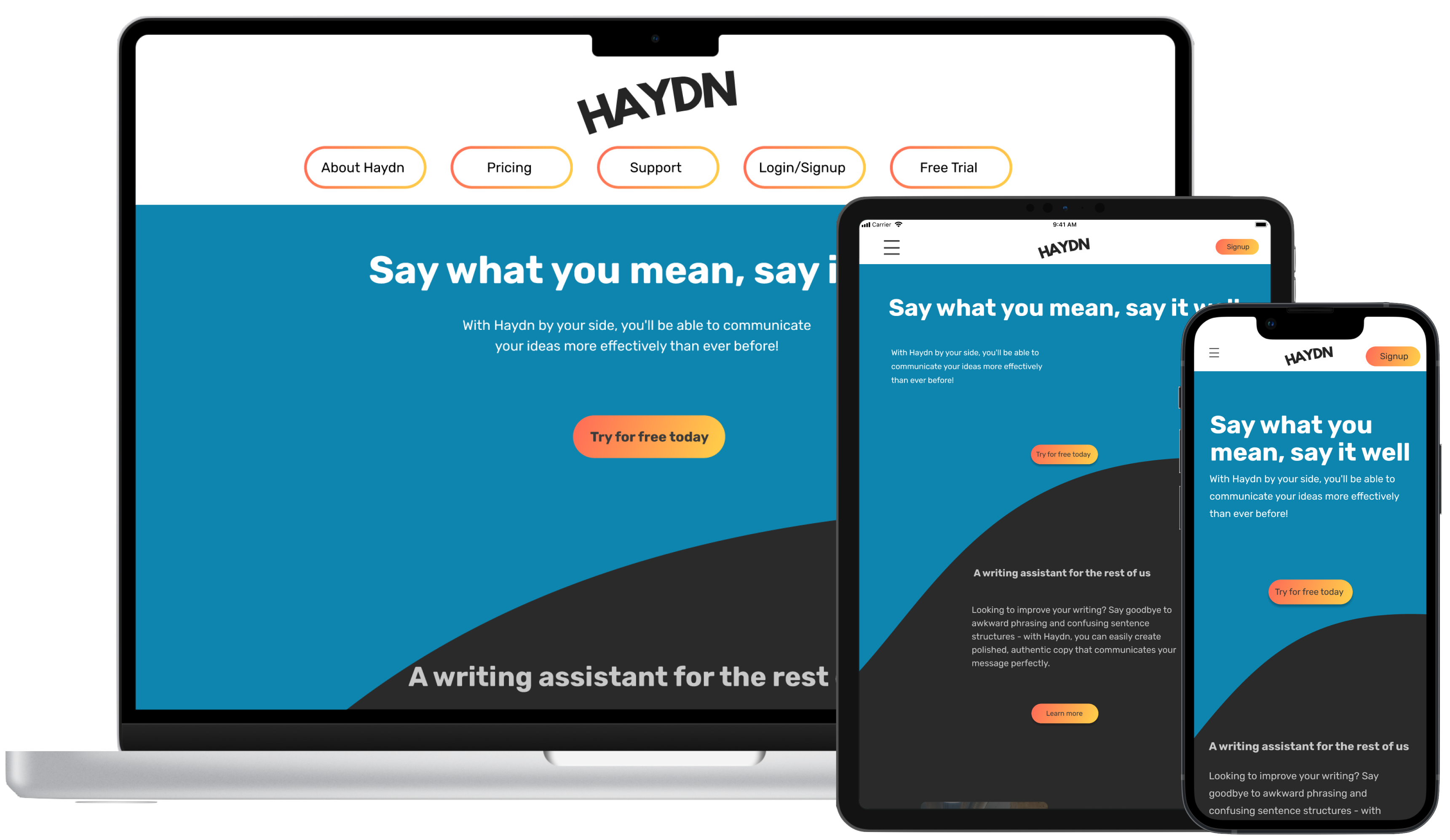
I went back to the style guide’s color palette and began ideating around yellow, orange, and blue. I eventually came across a strelitizia plant, otherwise known as the “bird of paradise”. The yellow-orange combination felt very strong against the blue and evoked a sunset over water to convey a beachy and calming experience for the user. The plan was to use the blue for backgrounds and the yellow-orange for CTAs.

With a color scheme evoking a summer day and a layout that smoothly transitions from section to section, users can discover information on HAYDN without feeling overwhelmed.
**The video will not play if your device is in low power mode. Refresh the page after you turn off low power and you'll be all set.**
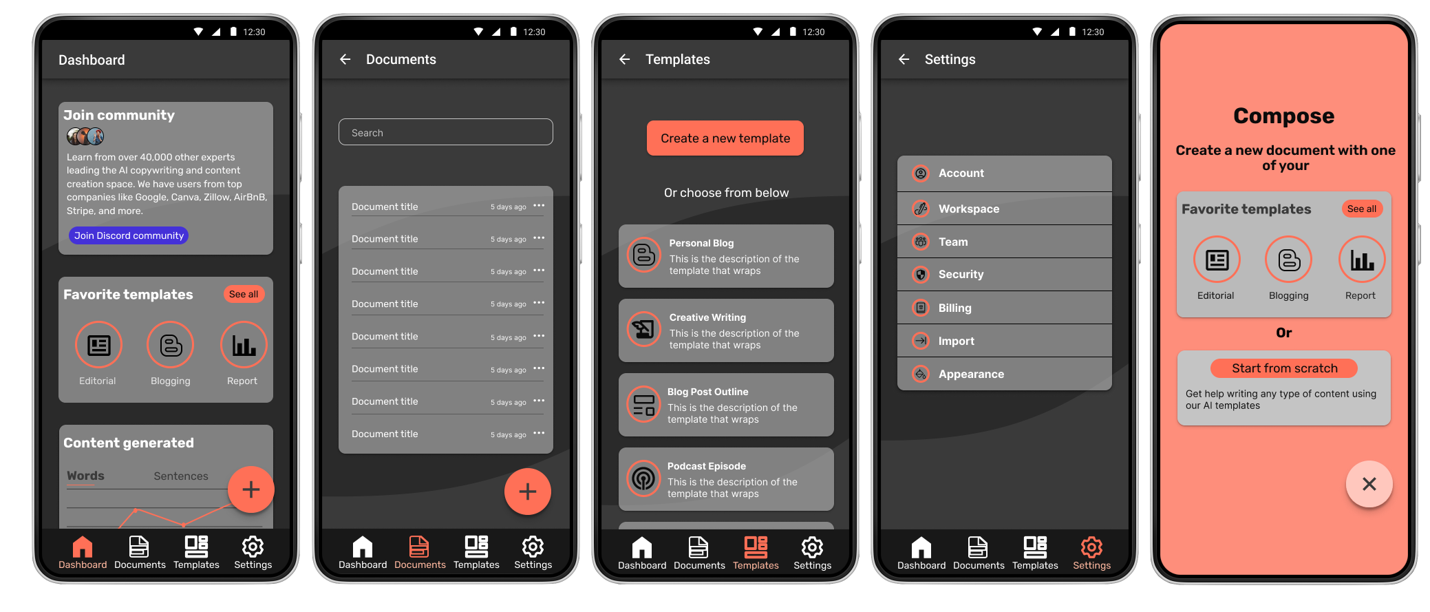
With a finalized landing page it was time to begin ideating around a design for an android mobile app for Haydn. I began with a similar scheme to the landing page and very quickly realized it was way too busy for the app. I was drawn into the charcoal and coral scheme (middle option below) as it felt like a natural progression of the landing page. The landing page was the sunset and now the app is the night.
As this was a school project, students were given the option of creating an Android or iOS app concept. As an iOS user who had just learned about Material Design, I decided to go with Android to challenge myself in new (to me) design principles.

This interface allows the user to have all the functionality of Haydn within easy reach of their fingers.
**The video will not play if your device is in low power mode. Refresh the page after you turn off low power and you'll be all set.**
While It would have been wonderful to run user tests on the flow and functionality of the landing page and app respectively, this was a great learning experience. This was the first time I have been given a problem that I had to solve within the parameters of a given style guide. I look forward to helping brands achieve their visions more in the future.